1. Design word
To
design using the words, there are some things that need to be considered,
namely the message, target, formatting, fonts and other visual elements. the message
should be able to communicate the specific design, the target is the reader or
viewer.
a.
Design with the word must
always convey a specific message. The word must be able to attract attention
and memorable.
b.
Consider writing format. The
word must be designed to be easy to read especially for posters or billboards
because there will be a factor when the distance to read the poster was
mounted.
c.
Using a visual hierarchy.
PPeople will tend to read the greatest element then the smallest. all factors
of spaced letters, word spacing and line spacing is easy to read,
communicative, and expressive. Word spacing and line spacing build a rhythm so
that viewers can membacaa message.
d.
Consider the shape of the
letter. Use the original letter, think about the relationship of positive /
negative space according to the space that corresponds to the message and the
audience.
e.
The color will enhance the
message and expression without impeding the ability to read the crowd.
f.
To perform the mixing of the
text, adjust to the ethnic to the message, in contrast, weight, scale and
visual herarki.
g.
Use the types of familiar
characters. For example Bodoni, Caslon, futures, univers and time novel. Avoid
anything new or decorative font type.
2. Designing a logo
Logo is
the brand identity that communicates extensively about products, services, and
the organization quickly. When designing a logo must identify the product or
business and create a logo that is different from the competitors. The logo
must be unique, memorable passage and easily recognizable dengaan quickly.
Instructions in logo design are:
Instructions in logo design are:
a.
Clear and legible
b.
Special (different from the
others and are not owned by the other party)
c.
Differentiate products,
services and organizations from competitors
d.
In accordance with the
business / organization
e.
Express the spirit, quality,
personality products, services and organizations
f.
Impact graphics
g.
Consistent with the principle
of balance and unity
h.
Create a positive
relationship
i.
Easy to remember
j.
Can work on the reproduction
of black and white as well as color
k.
Easily diminished and raised
3. Designing a meaningful illustration
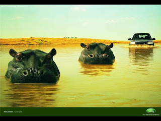
Designing
a meaningful illustration is a design that elements in it tells about something
meaningful (implied). As used by cars land rover imaging product that is
different from the other. As the car "off road" best, land rover uses
images hippopotamus sequence with cars land rover meaningful authenticity. Ad
titled "hippos" created by Young & Rubicam London using the
approach to humor.
4. Designing an illustration of the relation
sign
Illustration
sign relations are illustrated using a sign more specific than meaningful illustrations.
An object is a sign of something.
Polo Ralph Lauren company uses this illustration. Namely polo characterize high status, both financial and the royal family.
Polo Ralph Lauren company uses this illustration. Namely polo characterize high status, both financial and the royal family.
5. Designing illustration symbol
Illustration
symbol is an illustration of the object as a symbol. Illustration symbol
consists of illustrations allusion, metaphor and allegory. Designing symbol
aims to:
a.
Creating simple visual
b.
Displays information or
express meaning
c.
Creating a different sign
d.
Create a design that can be
recognized quickly
e.
Designing a symbol that
sesuian with an idea or something is presented
f.
Designing a symbol that can
work well in black and white reproduction
g.
Designing a symbol that can
work on multiple size
Figurative
illustrations using shape comparison, a similar example, or as a combination of
items of different classes of experience. For example "love" is
similar to the flowers "roses".
Ilustraasi different metaphorical allusion in comparative form. In the figurative, love illustrated by Bungan rose, while the metaphor of love is a heart of gold.
Ilustraasi different metaphorical allusion in comparative form. In the figurative, love illustrated by Bungan rose, while the metaphor of love is a heart of gold.
Illustration
allegory is an extension of the metaphor. Illustration allegory is an
illustration of the equation object in the narrative part that carries meaning
beyond the narrative itself.
6. Layout
Regulatory
layout and visual letters on a two-dimensional surface so that all information
can be read, clear and menark. Layout is pegaturan letters and visual in a
print or electronic page. Before designing the layout, start with the
following:
a.
Target: anyone who read or
see
b.
Style: look what is suitable
for audience
c.
Purpose: the function of the
design
d.
Information: information or
messages to be delivered
e.
Installation place: where it
will be seen
Design
principles that affect the layout is the focus point of visualhierarchy, unity
and balance. When building the focus point, then you create a main area
of interest on the page.
Suyanto,
M. Aplikasi desain grafis untuk periklanan dilengkapi sampel iklan terbaik
kelas dunia. 2004. Yogyakarta : Penerbit ANDI

0 comments:
Post a Comment